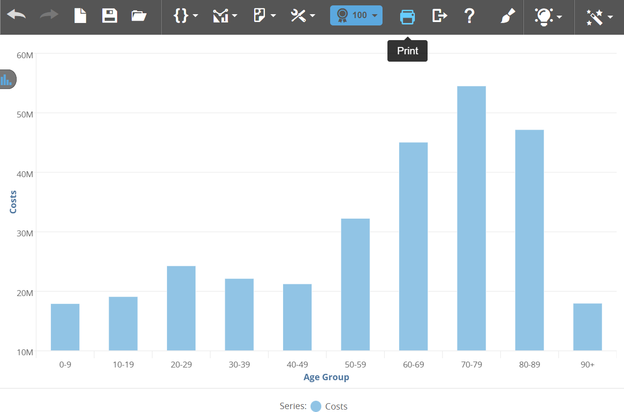
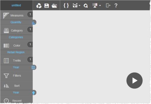
Visualizer gives you flexibility in how you get started creating a report. You can also create a tabular view or a chart view of your data.
Topics on This Page
Access Subject Areas
Visualizer supports multiple subject areas, including those that are custom created by an administrator.
You can select attributes and measures from multiple subject areas for use in a report.
- In the top
menu bar, click Subject Area.
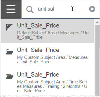
 Tip: If you know the name or partial name of an attribute or measure, click Search to locate it. The search results display the fully qualified names and allow you to select objects from multiple subject areas. Visualizer displays a list of the available subject areas.
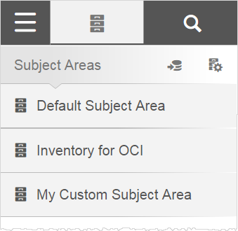
- Select a subject area to access its attributes and measures.
- Navigate through the subject area lists to add attributes and measures to a report.
Create a Report with Data
If you are familiar with the data you want to visualize, use search to quickly locate the columns to build your report. If you are not familiar with the columns available in your data, you can browse the measures and attributes in the subject area.
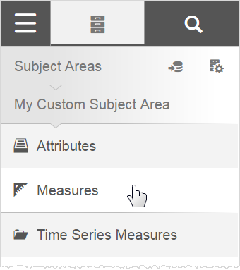
- In Visualizer,
locate a measure by performing one of the following actions:
-
In search, start typing the name of a measure. Visualizer searches
all of the measures, attributes, and folders in the available subject areas.
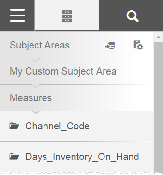
- In
the subject area, click Measures to browse the list of available measures.
 Note: When the name of the attribute or measure includes an underscore (_) or period (.), those characters are omitted from the name in the subject area and other parts of the Visualizer interface.
-
In search, start typing the name of a measure. Visualizer searches
all of the measures, attributes, and folders in the available subject areas.
- Select a measure
by performing one of the following actions:
- Click the name of the measure;
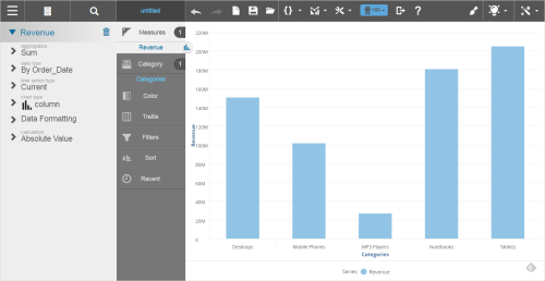
- Drag and drop the measure on the Canvas. Visualizer adds the column to the appropriate
bucket in the Chart
Builder and builds a visualization on the Canvas. By default, it creates
a column chart as indicated by the column icon on the
tab next to the measure. Tip: If the Chart Builder menu does not appear in your web browser window, the browser font size might be too large. To restore the menu, set the font size to medium in browser settings.

- Hover over the measure in the Chart Builder to view important details.
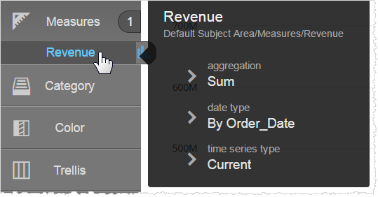
- In the Chart Builder, click the measure and
select from the list of options to change the
properties of a measure, if needed.
You can change the following: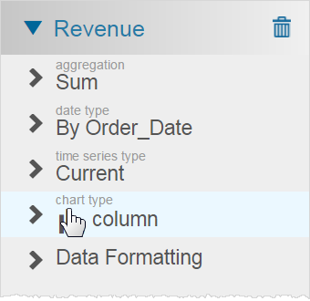
- Aggregation—Count distinct, count, average, maximum, minimum, or sum.
- Date type—By Order_Date, Ship_Date, or other date types that exist in the underlying data model.
- Time series type—Current, trailing 12 months (TTM), trailing 3 months, month ago (MAGO),
quarter ago (QAGO), year ago (YAGO), quarter to-date (QTD), year to-date (YTD).Tip: If you change the Time series type, you must also add a Time attribute such as Time.Month, Time.Quarter, or Time.Year to the report.
- Chart types—Shows the current chart type and allows you to change to a different chart type.
- Data formatting—See Format Data in a Chart and Format Data in a Table.
- Calculations—This option displays after you add an attribute along with the measure.
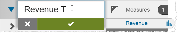
- In the Chart Builder, double click on an attribute or measure label to display a properties list, then double click the property name to open the edit box, type the
new name, and click Apply.
- Click
Subject Area to go back and find the attributes.
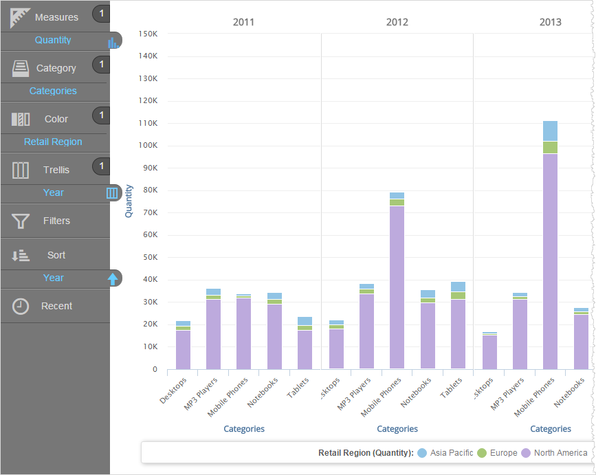
- Add an attribute. The Chart Builder adds the attribute to
Category and plots a bar chart.
 Tips:
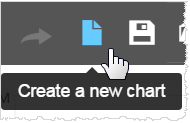
Tips:- If you want to clear the current report and start over,
click Create a new chart.
- You can drag a column from one section (also called a bucket) in the Chart Builder to another, such as when you want to filter or sort a column.
- To delete a measure or attribute, drag the name of the measure or attribute from the Chart Builder to the subject area and drop it on the trash.
- Click on items in the legend to hide or show them in the visualization. Click the legend icon if you want to show only the selected item and hide everything else in the visualization. Click the name in the legend to show everything except the selected item.
- Visualizer has a 50,000 row limit for tabular data and a 2,000 points/rows limit for chart data.
- If you want to clear the current report and start over,
click Create a new chart.
- Add any other attributes and measures. Some chart types require columns to be added as colors, sizes, or shapes. You can also create trellis charts.
- Add filters or change the way the data is sorted, as needed.
- Optionally, change the style of the chart by changing its chart type.
- If needed,
you can create an expression
and add it to your visualization.
Tip: You can change the axis labels.
- Click Save.


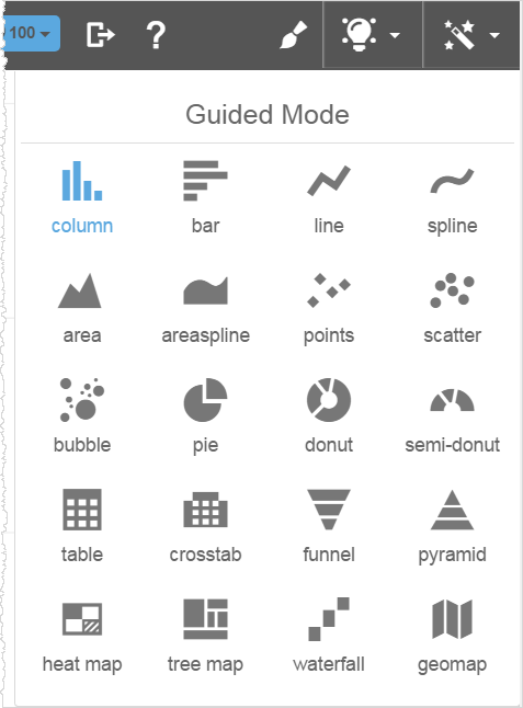
Create a Report with a Chart Type
If you know the type of chart you want to create, select the chart type. Visualizer provides guidance on how to create the chart.
- In Visualizer,
click Change Visualization to display the types of visualizations available.

- Select the
visualization type you want to use. Visualizer indicates which attributes and measures are required to create
the report type. Many charts need only one measure and one attribute.
Others, such as bubble charts, need more data to create a
useful visualization.
The Chart Builder displays only the sections (e.g., Color and Size) that are applicable to the chart type that you select.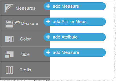
- Add measures
and attributes and save the report.
Undo and Redo
You can undo and redo most actions from the Visualizer menu bar or by pressing Cntrl-Z/Cntrl-Shift-Z or Command-Z/Command-Shift-Z.
Undo/redo applies to the last 20 actions. When you save a report, Visualizer resets the undo/redo history. Undo/redo applies to most report-building activities, including chart formatting.
The following actions cannot be undone/redone:
- Enabling or disabling Delay Charting mode
- Uploading custom maps
- Saved expressions
- Saving and renaming files
- Editing Column Selectors
- Creating color palettes
- Advanced conditional formatting
- Clicking a legend to hide columns
- Creating and saving expressions in the Expression Editor
- End User Data Blending
Delay Rendering for Improved Productivity
By default, Visualizer builds your charts and tables as you drag and drop attributes, measures, etc. When you build a more complicated report and you are familiar with its objects, you may not want to spend time on re-rendering. The Delay Charting option allows you to render reports as needed.
- In the Settings menu, enable Delay Charting. It is available for both tables and charts.
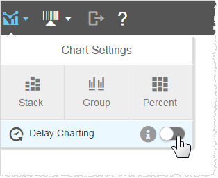
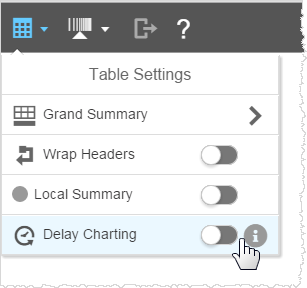
- Drag and drop your measures and attributes. The Chart Builder displays the components of the report, but the work area does not yet display the report itself.
- Click Render.

Visualizer renders the table or chart and resets the mode.

- Click Settings → Delay Charting to delay rendering again.

Set the Result Limit
When you create a report, Visualizer limits the number of rows in a query result to 100 by default. This is indicated in the Visualizer toolbar.
If the total number of data points in a report exceeds 100, a notification displays prompting you to change the limit to accommodate more than 100 data points.
- Click the icon.
- Click Custom.
- Select the number of rows.
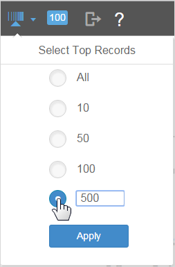
- Click Apply.
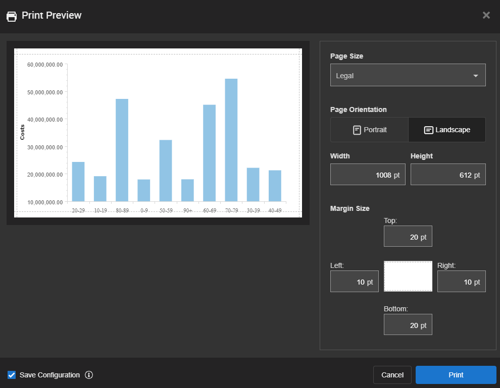
Configure Print Settings
After saving, you can use the Print option to configure the print settings of your report.
- Click Print.

- In the Print Preview window, you can set the print parameters for the report, including page size, page orientation, page width, page height, and margin size. The changes reflect in the preview image.
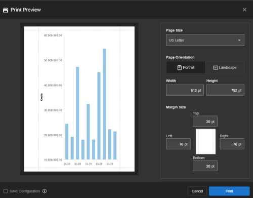
- Select the Save Configuration checkbox to use the print settings for the Visualizer report as the default print settings when that report is embedded as a dashlet on a dashboard. Note: The Save Configuration checkbox displays after you save the report.

- Click Print. A PDF of the report downloads to your computer.